I have been planning on making this blog entry in a while. It's a quick lesson on color theory and how to apply it to one's art. My own application of it sucks, but you can probably do better. I will not put this under a cut, so sorry for the long post.
To start off, the basics that must be discussed:
I'm sure everyone had learned about warm and cool colors, am I correct? Yellow, red, orange are warm and green, blue, and purple are cool?
That is not how I learned it and, if you wish to learn from this, please be willing to expand on that.
There are, indeed, warm and cool colors, but they are not limited to red in warms and blues in cools. There are both cool and warm reds, and cool and warm blues.
A quick lesson: the primary colors are red, blue, yellow.
Their complements are, respectively, green, orange, purple.
Please keep that in mind.
Now to begin, below is a scan of the warm double primary assignment I did (in gouache for the curious). Sorry for the horrible scan, may redo this digitally later.
Lesson 1: Basics of Primary and Secondary Colors- Warm and Cool!

These are all warm colors. The red, yellow, and blue are all warm. (they are the bottom left, top yellow, and bottom left colors on the diagram). This diagram was useful in learning how to create the complements of all the colors. For one to get the complement of the warm red, you cross the warm yellow with the cool blue and you'll receive a warm green. Warm blue and warm red equal a warm purple, yellow's complement. And Warm red and Warm yellow give you warm blues complement, warm orange.
The next one is the cool color double primary diagram:

Once again, sorry for the shit scan.
You may notice that the cool red, bottom left, is more similar to a rose/pink color. That is correct. The same concepts apply to this one as did the one before. The cooler colors tend to be brighter. You may notice that the traditional 'warm' colors look better on the warm diagram, and the traditional cool colors look better in the cool. Thats because the whole 'green,blue,purple' are cool colors use the cool versions of the colors, not the warm ones. And the same for the warm colors. The one that stands out is yellow, that is often considered warm, but the color everyone imagines is the cool yellow.
Next we'll be discussing tint scale, intensity, and value.
Lesson 2: Tint and Value!

For this assignment I chose two complements, in this case cool blue and cool orange, and made this diagram.
The definition of tint is 'a shade or variety of color'. Namely, how much of a color there is in it. Notice I go from white to the purest of the cool blues. Each time i take a little bit of the 'tint' away from the blue by adding some white. It creates a value scale.
Up and down the left side is a value scale. From white to black. I don't think I need to explain this one.
The middle scale, the Intensity Scale is taking the two complements, blue and orange, and put them on opposite ends. I then add a little bit of blue or orange working my way across to get the correct color. So the circle next to the purest blue actually has a little bit of orange in it. When you add them correctly in perfect 50/50, the two complements should create a neutral gray tone, but that's the next lesson.
The vertical scale next to the value scale is trying to match the tint of the orange to that of the grey of the value scale.
Value is something that needs to be understood very well. If there's anything you take away from this post, it's this.
By definition value is 'the relative degree of lightness or darkness of a particular color'. What that means is even if you have orange and pink, they can both have the same exact value, even if they aren't the same color.

This value scale is a little off because I didn't understand it. My grey scale is all sorts of fucked up. But it gets a point across, you should be able to look at a grey scale and a color and be able to pint point where on the achromatic value scale it will fall. If, say, you have a medium-dark pair of jeans on, you should say, "oh on a seven-point value scale this falls at about a 5 or 6".
To be able to figure out value of color is absolutely instrumental in the arts. You cannot go anywhere if you don't understand the difference between value and color. I'll probably make a later blog post talking more in depth about this but, just know, 1- you need to know how to make a 7 pt. value scale and 2- you need to know how to place colors, no matter which, on that scale.
Lesson 3: Chromatic Greys!
Warm Chromatic Greys

Anyway, carrying on. Chromatic greys are simply greys made from mixing complements (blue/orange, red/green, yellow/purple) together. If they are mixed perfectly together, you should get a neutral looking color. It is pretty difficult to get these perfect and I got kinda lazy up there. These are impossible to do digitally. But, still, you mix them and you should get a neutral-looking color.
Cool Chromatic Greys!

Lesson 4: Intensity Scale

This was mentioned back in lesson 2, but it bears repeating. The intensity of the color means how bright it is, or how pure- undiluted. The coloring became off during scanning and photoediting, but the way to set up an intensity scale is on the ends of the scale (I used 7 levels of color in these) you want to put two opposite complementary colors on each end and, by mixing them together, make a scale. (sorry the cool yellow/blue scale got cut off! ). The middle scale is just the cool blue/orange scale with white added. I obviously messed up on that but the lesson here is to learn is what colors can be attained by simply mixing complements.
And also to control the mixing of colors. It was a practice run but one should try to make at least a few of these. Note how the colors dull in the middle and the get bright when it gets closer to each end.
Lesson 5: The Chromas!

This lesson is kinda fun. Here we learn the definition of the chromas. For these I set up a still life, and made a quick sketch. Then from that sketch I created several paintings. The first one is up there, and its achromatic.
Achromatic means latin root a- lacking latin root chroma color. This one is lacking in color or in grey scale.

People get the next one and achromatic confused a lot. Monochromatic does not mean lacking in color. Latin root mono means one.
Monochromatic means 'one color'. Or that one color is used throughout the painting, with various levels of tint (look back to lesson to for more on tint).
Next one is analogous meaning 'proportionate' but that doesn't say much as to what it means. On the color wheel the analogous colors are the colors one either side of the original color. So my analogous painting was made with two colors: the color to the left and the color to the right of that base purple from the monochromatic painting.
Analogous is a bit of a harder concept to get, but simply its knowing how to create value and a painting using two colors close to, but not quite the same from the original monochromatic.

Next we have the complementary painting! This one is just as it sounds, one uses two complements and builds up value using them. I don't have a lot to say on this one? Oh, when painting shadows ALWAYS mix in some of the original color into it, or it'll look shitty.
Speaking of shitty, lets talk about that split complementary painting.
Yeah I half assed that painting like crazy but lets talk about it. Split complementary is, essentially, the same as analogous painting, except you choose the colors for both complements. I went red/green this time because, I remember, I ran out of the stupid yellow gouache :|. But, once again, you're getting colors that aren't quite the original base color but still maintain that complementary relationship.
Ok I got lazy on this section, please ask any questions down below in the comments.
Lesson 6: How Warm and Cool Effect a Painting
Like I've said through this whole mini-lesson, there are warm and cool versions of each color. This could change the entire look of a painting. One must understand how warm and cool colors work to create a cohesive paintings. You wouldn't paint a warm painting but have the shadows be cool, right? That's bad planning. So, this next section will give visual examples on how cool and warm colors change a scene.
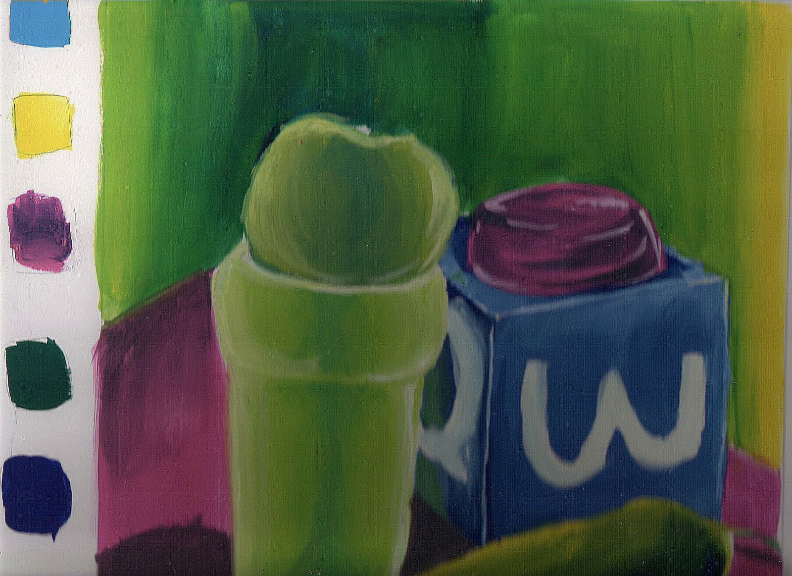
Warm Color Painting

The quickest way to tell if a painting is using a warm or cool theme is to check the yellows. In this one I used a more golden color, that being the warm version of yellow. The colors I used in this painting are all on the left side, lined up. I made an error in photoediting and made the shadowing on that apple/cup far too blue but, whatever lets go with it.
In general, using black to 'darken up' areas is pretty taboo in painting. I mean, you CAN do it, but its lazy and gives an odd look to any area you add it to. That is the reason why understanding chromatic greys and color mixing is so important. In this painting, I mixed the blue and yellow to give it a more greenish/yellow hue for the shadow (came out blue here).
The same applies here. Note how different the painting looks even though I used the same colors, just cool this time.
Lesson 7: Atmospheric Perspective!

This lesson will be simple and quick. Atmospheric perspective is being able to show space and distance in a painting or drawing using color, tint and value. The closer an object is to you, the bolder the colors and, typically, the warmer the colors. As more distance is gained, the colors become much cooler (cool blues and purples) and much more desaturated. That means that the colors aren't as bright or as vibrant.
The painting above shows an example of atmospheric perspective. Also, note, as more distance is gained, less detail is applied.
That's all for now until I find my text book with more information. If there are ANY questions, please ask. Also please comment if you want me to cover another subject or, maybe, go into more detail into anything covered here. I know some of the lessons were quick and not in detail but this blog post is trying to cover a semester of a class in a few paragraphs.
Any criticisms are happily encouraged.